The 10 Most Magnificent Coaching Websites of 2024 (And Why They Work)
I’ve spent over 30 hours looking for the best coaching websites of all time.
These sites aren’t just good. They’re magnificent.
I’ve chosen the best website from each coaching niche; the list itself is in no particular order. I’ve also included some honorable mentions for each niche.
👋🏽 Before you dive into the list, you’ll want to download my free “8-Step Website Optimization Checklist.” It walks you through the most important things to include on your coaching website if you want it to actually get you clients.
Click the button below to get it:
🏅 Best Coaching Websites Of 2024
Click the links below to jump to a specific niche:
Underneath the list, I’ll share 4 biggest mistakes coaches make with their sites (according to top web designers). Plus some frequently asked questions.
1. Jennifer Dawn
📈 Best Business Coaching Website
Why it works: The headline on the home page is very clear and compelling. It tells you exactly what the site is about. And I love the picture of Jennifer. When you scroll down, you see logos and certifications that add credibility, along with a description of Jennifer’s signature process. I love the clear call to action to Schedule a Call in the top right and the copy on that scheduling page is no-nonsense. The logo isn’t my favorite, but it doesn’t take away from the site’s effectiveness.
Honorable mentions:
2. Antoinette Dale Henderson
💼 Best Executive Coaching Website
Why it works: Antoinette gets top marks for this leadership coaching site. As soon as you load the home page, you know that she's an executive coach who focuses on gravitas. She also has one one call to action: request a call. Her site conveys credibility and professionalism. Antoinette includes a picture of her speaking, her books, and media logos. If I were the head of HR at a large company, I would hire Antoinette.
Honorable mentions:
3. Grace Brodeur
🏆 Best Performance Coaching Website
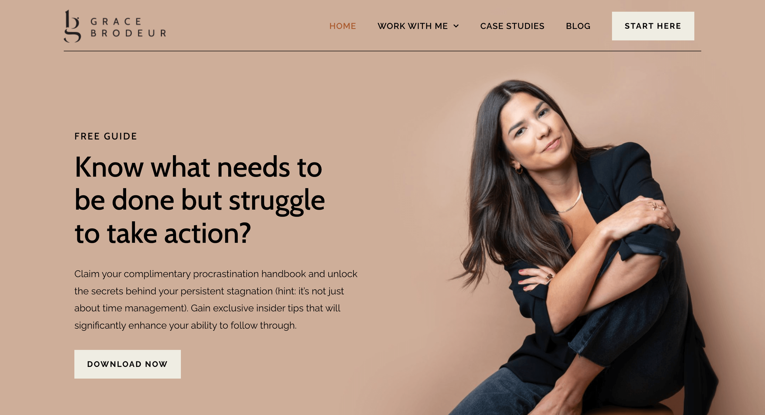
Why it works: I put mindset coaches, accountability coaches, and productivity coaches all under the header of “performance coach.” Grace is a former client of mine. She does a great job at niching down to one aspect of performance (overcoming procrastination) for entrepreneurs and creatives. The photography is beautiful. The site breaks down her two programs clearly. And the whole thing just exudes warmth.
Honorable mentions:
4. Patrice Washington
💸 Best Financial Coaching Website
Why it works: I love the video background that Patrice uses on the home page. The shots of her speaking create a lot of trust and credibility. I also like the tagline “Chase purpose…not money.” It gives you a flavor of what she does while also creating curiosity. She uses a free quiz to collect email addresses. She has separate landing pages for her coaching and speaking.
Honorable mentions:
5. Happen To your Career
👩🏽💻 Best Career Coaching Website
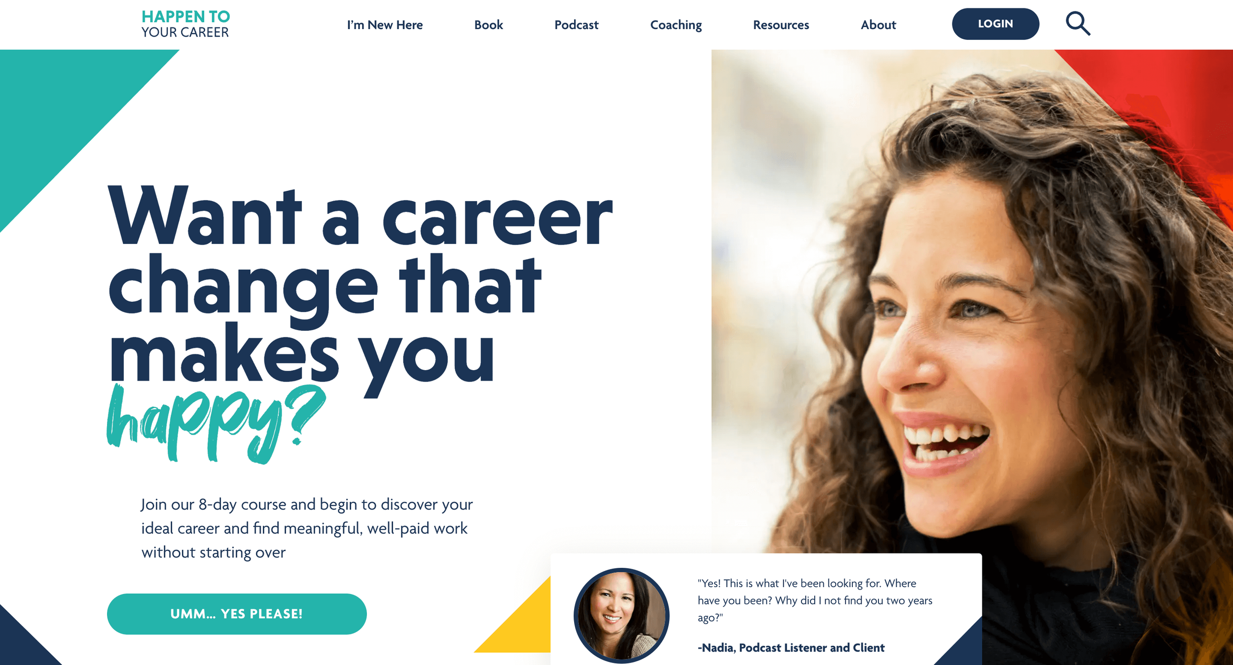
Why it works: When you land on this site, you feel like, "Okay, this company is legit." The branding is on point. They've been featured in major publications. The whole thing looks professional. The site also offers a lot of free resources to educate their ideal clients. They have a podcast, an 8 day email course, and a blog. Great job on the content marketing side. The one thing I would change about this site is making the Login button less prominent and swapping it for a different call to action, like the Coaching page.
Honorable mentions:
6. Kelly Keelan
🥑 Best Health Coaching Website
What I love about this site: Weight loss for women over 40. The niche is clear as day. Kelly's site speaks to her ideal client. From her Work With Me Page: "You’re Smart, Successful, and able to figure everything out...except weight loss." The picture on the home page may seem bold, but if I were a woman over 40 I would be ready to hand over my credit card to look like that. And she includes clear calls to action to opt in to her list and apply for a consult.
Honorable mentions:
7. Coaching With Krista
🧭 Best Life Coaching Website
Why it works: One of the main problems that I see with generalist life coaches is that their messaging ends up being too broad. They essentially target…anyone who has a life. Krista gets around this by narrowing in on the target market she can serve best: widowed moms. All of a sudden everything on the site becomes clearer and more compelling. She has a quiz that collects opt-ins and a great video sharing her story on the Work With Me page. Her testimonials are fantastic. Hats off to you, Krista.
Honorable mentions:
8. Physiquonomics
🏋🏽 Best Fitness Coaching Website
Why it works: You know exactly what Aadam does when you land on the homepage: he’s a fitness coach and writer. His site revolves around his in-depth, SEO optimized fitness articles. His personality shines through in his writing and each article contains beautiful illustrations. I also like how his Coaching Page is put together. It's easy to understand and, again, you get a good sense of his personality from reading it. Take notes, people!
Honorable mentions:
9. Sonia Wright, MD
🧡 Best Relationship Coaching Website
Why it works: The photo on Sonia’s home page exudes warmth and professionalism. The headline, "It's time to create the sexual intimacy of your dreams!" makes it clear what Sonia provides. She's put the call to action front and center with her "Schedule A Call" buttons. Sonia does a good job showcasing her background as a physician and a sexual counselor. You're left with a definite feeling of, "Okay, this woman knows more than me about sex." The name of her signature program made me laugh out loud.
Honorable mentions:
10. Madison Arnholt
🔮 Best Spiritual Coaching Website
Why it works: Great headline and supporting copy on the home page. This site has a whole vibe. It’s clear what Madison does and how to hire her. Plus, she includes the logos of very reputable companies when you scroll down, which give her credibility in a niche that can sometimes be seen as a little bit “out there.” For her target client, who wants help honing their intuition, the whole thing is just perfect.
Honorable mentions:
4 Deadly Website Mistakes, According To Designers
As part of my research for this article, I reached out to four of my favorite website designers. I asked, “What’s the biggest mistake you see coaches making with their websites?” Here’s what they said:
☠️ Mistake #1: Copy Isn’t Clear
"The biggest mistake I see coaches doing on their website is not making it clear to the website visitor: 1) Who they are, 2) What they offer, and 3) Who they help within 5 seconds of that person landing on their home page. This information should be clearly stated on the website's homepage banner above the fold along with a great attention-grabbing image and/or graphic."
☠️ Mistake #2: No Site Strategy
“The biggest mistake I see coaches make with their websites is not planning out the full site strategy. Think about your website like a Choose Your Own Adventure book. When someone lands on your site, what do you want them to do? What page do you want them to visit next? Then set up your content and Calls to Action (links, buttons, etc.) to make that happen. Never leave someone hanging on a page… give them somewhere else to go or something to do while they are there."
☠️ Mistake #3: Too Many Options
"The biggest website design mistake I see coaches make is having too many options of where to click and what to do on their site. I'm a big fan of keeping things easy for visitors with one main lead magnet and one main way to work with the coach as calls to action on my client sites. On the home page it's always about the lead magnet. If I'm a website visitor and I've never heard of you before, I'm not likely to go for the paid offer. But I'll certainly give you my email address for your lead magnet, if it's relevant to me!"
☠️ Mistake #4: Not Enough Content
One of the mistakes I see coaches making with their website is expecting people to visit without actually giving them a reason to. If you want a regular stream of visitors, you need to be sharing valuable content on your website that your audience are actually searching for. This could be through a blog, podcast or videos depending on how you prefer to create content. Doing this helps you to be found on Google, and you can share it with your email list and on social media, plus it gives you great resources you can refer to when you get asked questions. You also want to get clear on the purpose of the post when you create it, so you can include calls to action like subscribing to your email list, booking a strategy call or making a purchase, which allows your content to grow your audience and book clients.
The Bottom Line On Coaching Websites
So, what have we learned?
Your site doesn’t have to be the prettiest. It just has to get you clients. In order to do that, there are 8 things you need to make sure you get right.
✅ Get my “8-Step Website Optimization Checklist” for free and use it to improve your website. A lot of people miss Step #7 completely and it stops them from getting clients.
Frequently Asked Questions
What makes a good coaching website?
Three things:
Clarity: It communicates what you do and who you serve
Credibility: It builds trust with your potential clients
Call to Action: It helps visitors take the next step towards hiring you
Do you need a website for a coaching business?
No. Many online coaches run their business using just an Instagram, Facebook, or TikTok profile. But having a website can help grow your email list, increase your credibility, and get you more clients. When people search your name online, it’s nice if they can find your home base on the internet and not just a bunch of social profiles.
What should a coaching website look like?
A good coaching website should include:
A homepage that quickly conveys what you do and who you help
A clear call to action, usually to book a consult or join your email list
Testimonials or case studies to give you credibility
A high quality photo of you as the coach, ideally smiling
Some sort of content (articles, videos, podcasts) to build authority
In the perfect world, your coaching website would match your brand: professional, warm, fun, whatever. But having a pretty website is less important than having an effective one.
How do I create a coaching website?
The first thing you’ll need is a website builder. If you’re wondering what platform to build your site on, I highly recommend using Squarespace. My site, the one you’re on now, uses Squarespace.
I use the Amplify template from GoLiveHQ. Check them them out when you're ready for a new site. Get 10% off with the code: GREGFAXON10.
If you want to have your site professionally designed for you on Wordpress, I recommend working with Jennie Lakenan.
Here’s an interview I did with Jennie where we audited some of my client’s websites:


